Monday 8 December 2014

exercise: create a new soundtrack

OK,  I've changed my mind. It kind of felt bad not doing the exercise, and I really believe sound is half of the image (as mentioned in the course notes) so better practicing a bit... let's try and do the exercise. I have assumed the course notes make reference to the exercise in project 3, the feel of a frame, where we filmed the subjective point of view relapse of an alcoholic at home.
Here is the video, and below the list of sounds in it.


Note that describing sounds, not being an english native speaker, is not my thing. In the notes we are given some clues, like use a flavour, a smell, a colour, an emotion, physical texture...
  • the coffee machine: Mechanical, loud, vibrant, sour, dark, frightening.
  • the blinds opening: crispy, brisk, sharp.
  • the sound of the book pages and the book on the table: soft, melancholic, earthy.
  • opening the bottle: musical,  salty.
  • pouring the wine: joyous, musical, soft, light. 
Create a new soundtrack
Re-recording the sounds and editing them in the video editor. We need to create a new soundtrack for our video. The next things have been changed:
  • I have integrated the coffee machine audio between the two different shots, now the audio track is continuous
  • The blinds noise is recorded new, the previous audio discarded. Before we could hear other noises from the camera or the opening rod, i.e. the audio quality was bad.
  • In the TV shoot, I have introduced the sound earlier, when we are in the previous scene. I think this is cool, not any other particular reason. It helps to introduce a scene that is different from the previous, and quite different. 
  • I have joined the audios of the TV scenes, extending the audio from one scene into the next one and mixing them at the same level, so it seems more continuous, without obvious breaks.
  • I have eliminated sharp ends, i.e. when you stop listening to the TV, now it fades away instead of ending abruptly.
  • I have re-recorded the noise of the book. before you could hear noises from the camera, and the quality was not good, as the sound was almost imperceptible. 
  • I have re-recorded the sound of the steps. Again, the quality of the sound was poor, with some undesired noises. 
  • I have deleted, whenever possible, the noises from the camera and my breath. I have recorded "silence" in the room and filled the gaps with it. 
The results are below:


Friday 28 November 2014

exercise: listening


Find the most silent place you can. Listen. What can you hear?
At home, in the open kitchen - living room, and alone at home. I can hear some mysterious sound from outside, it's always there, and I'm never sure where it comes from, it might be some water pumps from the bay, or some kind of equipment in the office block in front of my flat, but it's continuous, and sometimes it stops, leaving a - sometimes awkward, sometimes peaceful  emptiness. I can also hear the noise coming from the fridge, not the one when it's noisy, but the one that is there when it's quiet. Finally I can also hear the noises that my electric heating does when it's kicking off, like somebody knocking at low pace. 
Then I try to listen the same "silence" through the earphones connected to my camera. None of them, except probably the knocks from the heating, can be heard, as the main noise is created by the microphone itself. 

Can you identify the sound of silence itself?
As a building services engineer, I have studied sound as a physical phenomenon, and the different levels and measurement of sound. I know that silence can be different in different places, I know that in a classroom, in total silence, you might have 60dBA, and to design a hotel room you should select equipment not noisier than 30dBA at night (how, if 60dBA was already silent!? ah, cause silence is subjective to the environment). 
I also know that the purest silence we can create is in an anechoic chamber, and the sensations in it can be really uncomfortable, up to the point that you can't stand in it very long. 
I also know that if you create a very low noise design in an office, the people will complain, because privacy is compromised. Then you have to create some background noise (still people will only hear silence, though) to negate speech sound in adjacent areas. 
To conclude, silence is a weird thing. 

Then the notes ask to analyse the objects that were subject to make sound in the sequence we did for project 2. As I can't find any "sequence" requested in project 2, I leave this exercise... too confusing. Let's move on. 


Monday 24 November 2014

exercise: atmosphere

Record two very short scenes (either a single shot or a maximum of four shots that edit together). Invent your own or pick from the list.
• A romantic dinner for two
• A depressed person alone at home
• Oh what a beautiful morning
• A stalker arrives
• A child takes its first steps

• Another mundane day at the office

Before you start, clearly define the atmosphere you intend to create. Think about how
you can use lighting, shade and colour to achieve this.
• Find a suitable location. Think carefully about available light and colour.
• Test how the light looks through your camera.
• Use additional materials to create desired colour and texture within the scene.
• Use reflectors and additional lights if they are available.
• Record your image(s) and edit them.


Well, this is not my most successful project. Should I have had some more time I would have tried harder, but I feel under the pressure of time, as I should already be doing assignment 2, so I have not waited to the proper light of set up the scenes properly. Below are the results for A Romantic Dinner for Two and Oh What a Beautiful Morning. 

A Romantic Dinner for Two


I tried to rely on the light of the candle to create the whole atmosphere, and it is not really successful, as we can see. Takes from above to the table, and during the dinner, would have possibly helped. 

Oh What a Beautiful Morning


In this case, it was almost necessary to have a sunny day. With more time I would have shot some takes at the park, with the sun through the trees, or having a coffee in a terrace.  
So, in summary, light is ESSENTIAL to create the atmosphere, and while editing the images I didn't stopped thinking that sound would also give a huge boost to the videos above, so lets move on to Project 10, Sound.

Tuesday 11 November 2014

exercise: reflected light

In this exercise we test different reflectors. I tested different white textures, such as a paper and a white cloth. The white cloth reflector gives a very soft and faded reflection that is almost not captured by the camera. The major differences have been recorded in this short clip, changing different coloured hard surfaces and the white paper.
With different colour reflectors we can give the tonal colour we want to the scene, even when the main source is the same.


Saturday 8 November 2014

viewing: light and colour - Matilda

We're asked to do some viewing in project 9, light and colour.
Firstly we need to look for sudden changes of light in a scene, and how are the changes justified or motivated.
Afterwards we need to look for use in colour to represent
  • change of atmosphere, 
  • emotion of a character
  • general mood or atmosphere or
  • a range of feelings, emotions and atmospheres.

To make things easy, I chose Matilda, which being based on a Roald Dahl novel, and targeted for all publics, seemed like a good movie to find colour and light use... and I was right.

Avoiding continuity problems
If the light changes within the scene, the spectator should know the reason of the change, otherwise it can be perceived as an error.
Some of examples in Matilda:

Day comes through the window

Someone turns off a lamp which we can see

Matilda tampers with the connection line of the school director's house

In the first and third ones we can see the reason of the light change and the light source. 
In the second image we don't see the source of the image (the window or the sun) but all is understood from the context. 

Colour
In Matilda, colour is also used to infer mood and atmosphere, as can be seen in the images below:
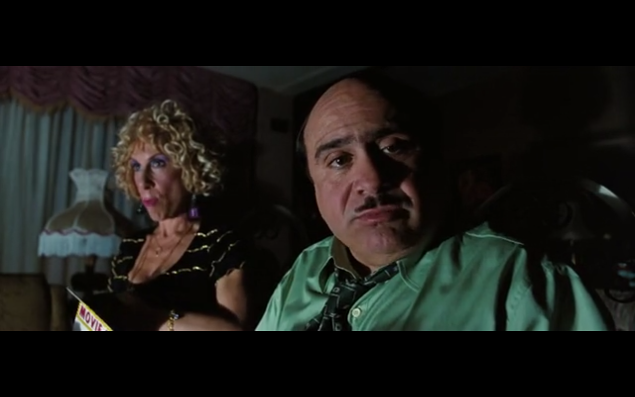
Dark colours, yellowish lights to show the bad tempered adults (though the parents of Matilda, who care little about her, are usually depicted in bright colours and tacky spaces, in situations where the mood of the scene requires it, the light is low and dark):


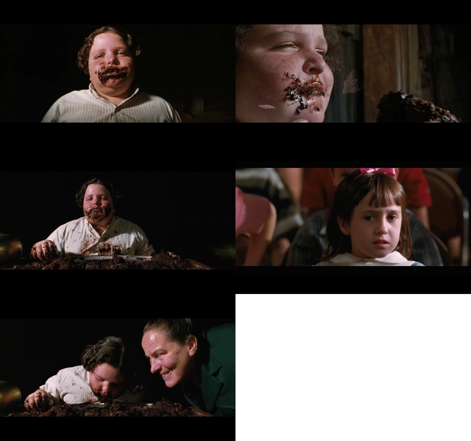
In the scene below the director of the school is punishing a pupil to eat a whole cake. The colours are dark, almost black in the whole scene, with a pitch dark background, and the only note of colour is from the students, who show hope as they'll begin to cheer the poor kid. He'll finally finish the cake, triumphant. 


Happiness is always shown with a mix of pastel colours and well lit scenes.


Sunday 2 November 2014

viewing: balance

In this project we are learning about balance in the image, the Golden Section and the Rule of Thirds. Looking at the projects I have already done, you can see that I do use regularly the Rule of Thirds when framing, as I have studied some photography and tend to do this quite naturally now.
In the drunk subjective point of view, for example, when the drunk looks at the shelf and notices the bottle, this is located in the upper left corner of the thirds grid, to try to catch the eye of the viewer even when there are more objects in the frame.
The same happens in assignment 1; when the woman applying the lipstick, the reflection in the small mirror is also in the upper right corner of the grid; or the horizon in the last scene is also in the lower thirds line.
What I haven't done so far is breaking those rules to create tension or communicate something, as I haven't thought of the dynamic use of these compositions.

Viewing Detectorist, I found many examples of the use of the thirds to locate the protagonists, but none of the opposite use (breaking the rule examples):


As I've done in other times (here, or here) I have tried to find the specific scenes in thriller movies. Then, I've been viewing Tesis, the first movie of Fernando Amenabar. Here the director uses the change in the frame, breaking the rule of thumbs, several times (case in point below) to create restlessness.


Wednesday 15 October 2014

exercise: images with depth

Thinking specifically about the sense of depth within the image, try to produce three
images that each represent one of the following atmospheres:
• Dynamic/exciting /adventurous
• Oppressive/dull/stifling
• Complicated/confusing/uncomfortable
• Refined/mature/reasonable

Complicated/Confusing/Uncomfortable 


I first took this video thinking of dullness, and was trying to get an image plain in colour, and compare it with the second shot, where I have included a tone of blue. Then I realised that the dull image needed not only to be dull, but also stifling and oppressive, which this is not... So I decided to use it to express a more deep emotional, wordiness, complicated feeling.
I think that, in context, this could be use to express this. Would really work well a hard light, creating deep shadows.
In terms of depth, the first image looks plainer than the second one, and yet the blue works OK with the mood in the image, as everything is grey/blue.

Dynamic/Exciting/Adventurous


I chose these three shots for the dynamic/exciting/adventurous subject. I thought that the sunset light would work really good with this theme, with its warm colour and soft quality, creating very soft shadings, and I think it has worked OK.
To create depth I have positioned the camera behind some people who was closer in the first two shots, so I am creating obvious depth with big elements in the foreground. I have also increased the focal length, so the distant objects are unfocused.
Wandering around with the bicycle then I found this kayaking competition. The sun was already pretty low, so the lighting of the scene is pretty poor, and I don't think this works OK with the theme, but in terms of depth it had a good use, as the warmer colour of the foreground light created depth with the shadowed area in the foreground. Depth is also created by the created perspective of the landscape and people (people in the front, and in the background building).
Action and dynamism, though, is mainly created by the subject matter and not by the shoot.

Oppressive/Dull/Stifling


My first go with this video was a shot of myself with a pile of clothes on the couch, and the light set up very low, lighting me from one side at 90deg.
The problem with that shot was that due to the light coming from the opposite side than the pile of clothes, it was difficult to see the pile, therefore you couldn't appreciate any oppressiveness. Also the depth was not very significant. On a second try of this approach, I shot from behind a bookshelf, so the same subject was framed by the furniture, giving the idea of a more closed and stifling space, and including the (required) element of depth into the equation. This didn't work either as you could not really see the messiness from the angle I shot.
Finally, I decided to go for the video above, where Juan is giving a kind of speech (he was actually moaning about having to help me with my homework). The depth has been created with illumination, as I have illuminated the shelves behind from above, in a dark space. The oppressive feeling has been created with the lighting on the actor - from below, and generating hard shadows - and also with the low camera angle.

Saturday 11 October 2014

assignment 1 - feedback and reflections

I received the feedback from my tutor, Robert Enoch, on assignment 1. In summary:

Well done:
  • push the limits in the story
  • experiment with framing, reflections, background and foreground 
  • Last scene: "I really like this shot, the evening light, the framing of the horizon and the edge of land and sea that once again has a metaphorical value here about frontiers. But you’re doing something very special with this shot, keeping the audience waiting, thinking about these things, thinking about the woman’s situation. When the guy comes along, and just sits there silently and they slowly turn and look at each other, there’s a wonderful comic philosophical question mark hovering over the whole scene about whether this is actually what they want. It begins to bring up questions about body and soul. There is of course a mystery here about whether this guy is the one who sent the message. But in a sense that doesn’t matter, because in this context we know little about the girl either and he is only the second person we have seen."
To work on:

  • think further the different shots that might be required. At the beginning, in the shots of the received message, the woman picking up the phone, the woman tapping, why not one single shot, zooming in? 
  • Work on the flow of the scenes. In general, the shoots are too long, for instance the first scene, with the phone on the table, or the sequence of the woman putting on make up - only the action of the lipstick would have been sufficient, with a "beat" lapse of time after she closes the lipstick. "All you need is the most telling moment"
  • light and exposure. Work on lighting the scenes, not only to allow adequate exposure but also to create the desired emotional effects. 
Suggested reading/viewing
Take a movie which has a strong sense of atmosphere and analyse one or two key scenes asking the questions:

  • What does the lighting and sound contribute to the mood of the scene?
  • Is the location, set or ‘mise-en-scene’ affecting the atmosphere?
  • How do the actor’s performances and the dialogue (if present) affect the atmosphere?
  • How does the montage (i.e. the sequence of shots) develop the mood?
To work on this proposal, I've watched Her, written and directed by Spike Jonze, cinematography by Hoyte Van Hoytema. The scene I've chosen is that one when Theodore, the protagonist, has a blind date with a woman.


While they are at the bar, the date seems to be going well. They drink and chat and seem to be having fun. They are comfortable. The mise-en-scene shows a futuristic restaurante, with warm lighting, which helps to the feeling of comfort.
The lighting elements also helps to make a kind of magical, futuristic environment, as the lights seem to be floating in the background. The fill in light is warm, as are the colours of the scene, most of them yellow and red.
The curved walls create a closed, embracing feeling.
The actors are both showing that they are comfortable with their body language (see the first image above when both are leaning forward, to each other, which express interest).
The montage moves from a wide frame (first image above) to every time more close close ups, until it ends with the face only of the protagonists. This sequence does also help to move us from seeing the ambient, the environment, to perceive their feelings closer from their expressions and looks.

Edit 29/11/15 to attach copy of my tutor's report:


Tuesday 30 September 2014

exercise: creating depth with lighting

Create a series of images with varying depth.
• Move objects around in the room, experimenting with perspective and lighting. Consider how you can use the lighting to create layers.
• Try adjusting the zoom on your lens. Place some items close to the lens and some further away. Start with a wide lens (zoomed all the way out) and then zoom-in in steps. 

For the next two pictures I placed the foot lamp in two different locations. When the lighting sources overlap, even when they apart, they don't seem to create depth (photo 1). 

1
2                                                                                               .  


The zoom creates the sensation that objects are closer between each other, an idea of flatness, as we could test in the previous exercise.  The sets of images below (3&4 and 5&6) show this, but the light spots help to create depth, focusing your attention on objects that, due to its size, are obviously closer than others (image 7 and the plant, compared with the person behind).
You would also think that the room used in 4 is smaller than the room used in image 3, though the space and camera position is the same. 

3
4
5
6

Finally, images 7 and 8 would seem to be done in a more cluttered space, but this would only be because we can see more of the objects in the image. 
7
8

All of the images would give a feeling of secrecy, mysteriousness, except probably image 8. This is because the light used is hard, i.e. creates sharp shadows in objects and people. 

Saturday 20 September 2014

exercise: depth

In this exercise we are asked to experiment with the depth of field in the camera, zooming in and out the same framing, where two objects are separated at different distances from the lens.
With the zoom out, or open, this is a short focal distance (18mm in the image below), the depth of field is big. The distant object can then be within the focus zone - although this didn't happen in my examples below - and the distance between the two objects seems larger. The best way of seeing this in the examples below is noticing the difference between the far side of the box in the 18mm and the 58mm images:


When you zoom in, increasing focal distance (and move away from the objects to have a similar frame) the objects seem closer between each other, and the distant object is blurrier as the depth decreases. Images are flatter with larger focal distances. 

The image below shows graphically how the focal distance affects the depth of field:

In the examples below the distance object seems always out of focus. This is because the distance to the objects also affects the depth of field, and I was taking the images close to the lenses. 

 
All graphics from http://www.blogdivvy.com/photog/depth-of-field.htm

Monday 1 September 2014

exercise: spaces

Capture four shots that have the following feel about them:

• An oppressive, cluttered space
• An open, honest, simple space containing one intriguing item
• A stark, empty hostile space
• A warm, friendly, cosy space

how they feel? what meanings  are implied?

An oppressive, cluttered space

For an oppressive cluttered space I've taken this picture of my utilities cupboard. It is an small, poorly lighted and full of stuff place, so I thought it could do the job quite nicely. The photo does not feel very oppressive though, possibly because, although I took it in a low angle, trying to get as many things "falling" over the lenses, the door was open, and the things somehow organised.
Probably a space with more things, like an old library bookcase, or this similar photo but from the inside of the wardrobe, would have worked better.
I also think that the viewer does not get the idea of a small space, as they can only see one corner, it could give the wrong impression of a more open and bigger room.


An open, honest, simple space containing one intriguing item

Since the moment I read the task I thought about an empty room, with one chair, and a bra on it. Don't ask me why because I don't know, I think the idea must come from some advert or movie... anyway, I thought that the photo could be nice with a well lit room and the result shown below is not too bad. 
On the one side, the room is nice and the tones of green of walls and chair make a nice effect. As the bra is the only black element in the room it could be thought that it would draw the attention, but on the other side, the picture has too many aliments, the windows are nice and the bright floor starves the attention from the chair and the allegedly intriguing element. I think the exercise would have worked better in a more simpler, emptier space.
The image, to me, feels more cosy and inviting than intriguing and interesting.

As the photo is taken in a room, what would there be of intriguing about a bra on a chair? what if I had took the chair to the outside... that would have been better, definitely. Then both the chair and the bra would have been quite out of place. 


A stark, empty hostile space

The picture below is a construction site being prepared. Because the light is rather nice, just before dusk, the place doesn't look too hostile, but the idea of leaving the background unfocused with the focused fence in the foreground gives a hint of hostility, prohibition and inaccessibility. The puddles from the recent storm also invoque starkness. 
I think that the desired feelings would have been better achieved if no signs of humanity, other than the fence, where shown, and if the day was less clear and no plants have been included.  


A warm, friendly, cosy space

Ah, as the name of this (b)log invokes, warmer than here...
This photo in a mediterranean beach, with the people doted in the horizon, evokes the feeling of feet buried in the very hot sand, the refreshing feeling of the water coming to you in tiny waves, and the warmth of the sun in the skin.
This is in my opinion the image that better achieves the objective of the exercise, but that is probably perhaps because I'm longing too much...


Saturday 16 August 2014

movies in colour

Checking out my course mate Helen Rosemier blog I have found a reference she makes to this web page. I love the extract of the colours and the very nice palettes that you obtain with some of the chosen scenes:

http://moviesincolor.com/tagged/john-hughes


exercise: mise-en-scéne - viewing


Freddie (Joaquin Phoenix) is falling asleep while he observes the master (Philip Seymour Hoffman) singing and dancing, surrounded by his family and friends. They are allocated in a way that they create an scenario, open to Phoenix, who is the spectator and Hoffman, the actor. This is created by the mise-en-scène of all the elements. As Phoenix falls asleep he "sees" (or more accurately he imagines) all the women in the scene naked. The spectator knows this is in the imagination of Joaquin Phoenix thanks to the lighting, and the sequence, as we've seen everybody dressed, we've seen Freddie accommodated in the shadows, falling asleep, and then the imagined scene with nude people, which looks clearly unreal. 
The lighting in the scene of Freddie in the shadows also depicts him in a different, obscurer world, closer to insanity.
All the elements of the mise-en-scène - i.e. settings, costumes and make up, lighting and staging - help creating this scene. 


The Third Man makes a extensive use of shadows (and dutch angles, but that would be part of the framing side studied in the previous part of the course) to evoque suspense and anguish. 
Scene 1 above shows a little child who is the greatest menace to the main character at this point of the film, as the boy accuses him of killing his father and a bunch of people is following him, after the kid, through the streets of Vienna. To show this perilous situation we can see the kid, but also the light has been positioned so he has a big, dark and defined shadow, which is definitely more threatening that the actual boy. 
Scene 2 not only uses the shadow on the building, but also the neat reflection on the wet floor, therefore the menacing shadow seems twice as big in this scene. We can also see in the foreground two statues, depicting two men probably fighting, that adds tension to the scene and have intentionally been incorporated in the mise-en-scène.
Scene 3 makes use of a dark corner (all we can see in the first instance) to hide the police men, who we only see when they step forward. 
Scene 4 shows a dutch angle of a room, which is initially in darkness. When the protagonist, who is being chased, turns the light, the image depicted above is what he can see. It is at the some time awkward and disturbing, and this has been created not only by the unbalanced camera angle, but also by the elements shown - a parrot, which is shrieking, the curtains, a kind or gown on a hanger... 
Finally, the last shot in the film, when all has been solved and cleared, depicts a wide path, well lighted, in a very symmetrical image (scene 5 above).  

It has been more easy to identify the lighting of the scenes in the two films above, the use of shadows and clear areas or darker and clearer scenes, than the position of elements to generate moods or feelings. Some of the images above from The Third Man convey a feeling just with the mise-en-scène, and it would not be needed to follow the plot to know that what is going on is rather unquieting. 

The exercise asks now to go back to Project 2 and analyse if the mise-en-scène had an (involuntary) impact on creating a mood. Definitely the third part of the exercise includes elements that create a kind of tension that would be needed for understanding the scene, mainly the black cat and the broken vase. I did not draw using shadows and lights, but I should definitely try to do that for the next sketch.   

Monday 11 August 2014

Mise-en-Scene

Definition

"...the term (is used) to signify the director's control over what appears in  the film frame. As you would expect, mise-en-scene includes those aspects  of film that overlap  with the art  of the theatre: setting,  lighting, costume, and the behaviour  of the figures.  In controlling the mise-en-scene, the director stages the event  for the camera."
Bordwell, D. , Thompson, K. (2008), Film Art: An Introduction. 8th ed.McGraw-Hill

The mise-en-scene-en-scene does not always need to be planned, the authors clarify. Unpredicted events or actors improvisations have their own impact on the shot (natural light may be used and is unpredictable, an ocasional storm that could be used for the scene, etc.). 


The first director to use mise-en-scene-en-scene was George Méliès, who created fantasy worlds, customs, sketched every detail of the shot and edited his films in the very early 1900's. The video above is for his Le Voyage dans la Lune (The Trip to the Moon), 1902.
Within mise-en-scene we can control

  • setting
  • costumes and make-up
  • lighting
  • staging


nude portraits - Polly Penrose


Polly Penrose - photo part of 'a body of work'

So very interesting reading the article about Polly Penrose in the British Photo Journal. How she repeats the photo once and again until she's happy with every detail, tweaking her position, getting the shape she's looking for. Also how she's been looking back at the pictures and realising how they show the feelings she was going through at every different moment. 
Beautiful project. I hope we can see how it keeps on evolving and growing. 


Thursday 24 July 2014

a date - alternative ending


assignment 1 - a five shots sequence

For this assignment you will produce a short sequence, of no more than five shots, that tells
a simple story using images alone.


Story 
She's at home and receives a message on the phone. It's him. He's asking to meet today. After considering it just for a second she answers. Yes. 
She gets ready, just as she does for every date. She wants to look pretty. 
Then, as in every date, she takes the bus to the park. While waiting, she thinks on all the other dates they've had so far... It's getting a bit less weird every time. Then, finally, he arrives. 

Storyboard


Shot 1 - A mobile phone is on a table, then it receives a text message. A woman takes the phone and answers the message. 
For this shot not much information is needed. I have chosen a close up of the phone, where you can see the table and then the hand that takes the phone, although you cannot see the person taking the phone and won't know who she is until the next shot, when you would only assume that was the person taking the phone.
It is important for the story to see the message "Shall we meet today?" therefore the close up should be close enough to allow the reading.
The point of view is a third person type, from outside the action, although to read the message it must be very close to a subjective POV.
The camera angle needs to be high, so the mobile screen is clear, and the object of the shot (the phone) clear to the viewer. There is no need to imply any feelings with the camera angle for this shot.

Shot 2 - The woman gets dressed in front of a mirror.
I have decided to use mid-wide shot and a mirror reflection for this shot. This will allow to show a bit more of the room, and as she is looking her reflection, smoothing her dress, the shot will imply she is getting ready for some special occasion. In frame the viewer will see the mirror and her full reflection, and in the foreground her back.
A natural angle will work ok, as if someone were looking from behind her.

Shot 3 -  The woman puts on some makeup.
To keep on playing with reflections and giving a clear idea that she is getting ready for a special occasion, this shot will show her in the bathroom, putting on some make up. The shot will be similar to shot 2, using a mid shot and mirror reflections. Again, a natural camera angle will suit, as the shot does not require to imply a particular feeling.

Shot 4 - The woman waits for a bus in a bus stop.
A very wide shot, showing the whole bus stop and the woman waiting. The bus will arrive and leave, and the shot shall keep the same framing to show that she has left.
The shot is showing pretty much all the information required and nothing is left outside the spectator's view range, except possibly the road. The viewer will notice that the bus is coming, though, thanks to the road noise.

Shot 5 - The woman is waiting in a bench, when a man arrives and sits in the same bench, but keeping some distance between them. It might be him, who sent the message earlier, or it might not... the viewer would not know. The woman and the man will look at each other for a couple of seconds, and then will look at the horizon, not saying a single word.
A wide frame will show the bench, and a little bit of the park. When the scene begins, the woman is already seated, so she might have been waiting for some time. I'll keep her arrival out of the scene as this information is not required.
The camera angle is a natural angle, slightly low. When the subjects look at the horizon they will be looking over the camera POV, but just slightly, to give a sense of openness and infinity.


Evaluation
Overall, I am quite happy with the sequence. The story is pretty much nonsense, but still has some enigma in it. I think the flow of the story has been well captured, and it has rhythm. In terms of planning, the final result is not far away from the first draft of the sketch. The main changes came when I re-read the assignment description and realised that I was limited to 5 shots, after that I re-draw the sequence and the sketches have really helped me to focus in the scenes and to know what I was looking for. I'll develop this further shot by shot. 

In shot 1 it could be understood that this is a subjective POV, due to the approaching angle of the hand that takes the phone. Then it wouldn’t make sense… is the subject staring at the phone, waiting for it to receive a message? That was not the idea that I wanted to express, therefore I think the angle of the approaching hand should be more open, so the camera is further away from the subjective POV. In the future I think it's worth it to film and then watch the scene filmed to identify these things that might not be so obvious from behind the camera.
Afterwards, when the spectator can see two hands grabbing the mobile, it is clearer that the viewer is a third person in the scene and it works better. In my opinion the close up of the phone while the woman is answering the message works well, as it allows to read the text and gives some dynamism to the sequence.  
There is a fade to black in between the different frames that doesn’t fit very well. I need to pay attention to how frames and sequences are stick together in series and movies, as I don’t know how to change between frames and scenes. This shall help me in future sequences.

I think shots 2 and 3, while she gets ready, have worked well. In my opinion the reflections on the mirrors are achieving the intended idea of enlarging the space shown, and fit in the story, as the woman gets ready for her date.
Shot 3 was finally recorded with a slight low angle instead of with a natural angle as planned, but that was purely due to the position and location of the mirrors. I think the final result is satisfactory.

Shot 4 was complicated, as I the shot raw was uninteresting, and trying to cut it was difficult. I did only one take of that shot, it was cold that day, and the buses were not stopping in that particular bus stop, so the only time that the bus was filmed it was driving quite fast, and far away from the bus stop. I did several cuts modifying the bus velocity, so it kind of looked like the bus was stopping, but none of them worked OK. Finally I cut this series of shots with cross dissolve transitions. I’m happy with the result, that shows time pass, and the final bus passing solution is not too bad, considering the available material. For next sequences I need to be more patient. Always more than one take is going to be needed. And I should wait for the bus to stop, as a lesson learnt.

The final shot, when the two people is seating on the bench, is my favourite one. I like the frame and the composition, the symmetry of the image, and I love the light. There is an alternative finale (actually this is not the original ending of the sequence) which I’ll post separately, but I finally chose this one as I feel it adds a little bit more to the story. 

Everything can be improved, but from planning to cutting, I think I have done a pretty decent job.