Saturday, 8 November 2014

viewing: light and colour - Matilda

We're asked to do some viewing in project 9, light and colour.
Firstly we need to look for sudden changes of light in a scene, and how are the changes justified or motivated.
Afterwards we need to look for use in colour to represent
  • change of atmosphere, 
  • emotion of a character
  • general mood or atmosphere or
  • a range of feelings, emotions and atmospheres.

To make things easy, I chose Matilda, which being based on a Roald Dahl novel, and targeted for all publics, seemed like a good movie to find colour and light use... and I was right.

Avoiding continuity problems
If the light changes within the scene, the spectator should know the reason of the change, otherwise it can be perceived as an error.
Some of examples in Matilda:

Day comes through the window

Someone turns off a lamp which we can see

Matilda tampers with the connection line of the school director's house

In the first and third ones we can see the reason of the light change and the light source. 
In the second image we don't see the source of the image (the window or the sun) but all is understood from the context. 

Colour
In Matilda, colour is also used to infer mood and atmosphere, as can be seen in the images below:
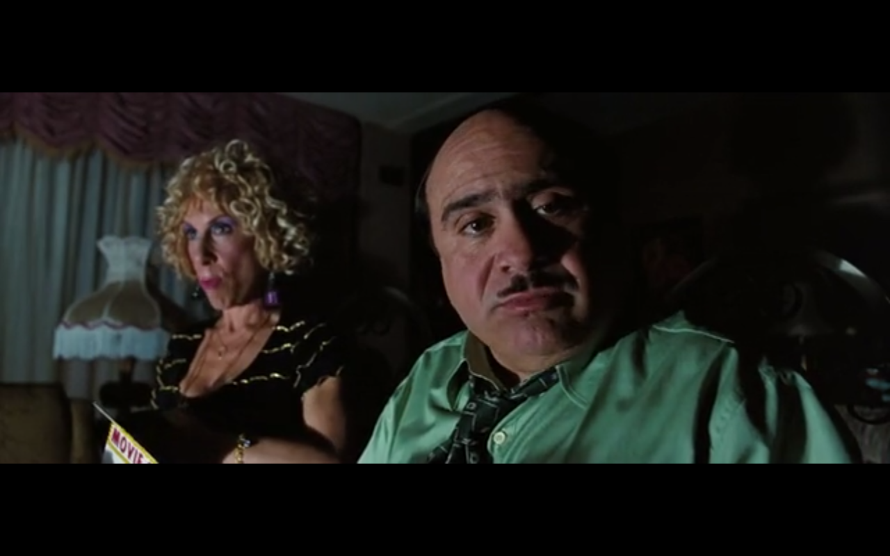
Dark colours, yellowish lights to show the bad tempered adults (though the parents of Matilda, who care little about her, are usually depicted in bright colours and tacky spaces, in situations where the mood of the scene requires it, the light is low and dark):


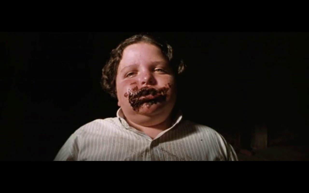
In the scene below the director of the school is punishing a pupil to eat a whole cake. The colours are dark, almost black in the whole scene, with a pitch dark background, and the only note of colour is from the students, who show hope as they'll begin to cheer the poor kid. He'll finally finish the cake, triumphant. 


Happiness is always shown with a mix of pastel colours and well lit scenes.


Sunday, 2 November 2014

viewing: balance

In this project we are learning about balance in the image, the Golden Section and the Rule of Thirds. Looking at the projects I have already done, you can see that I do use regularly the Rule of Thirds when framing, as I have studied some photography and tend to do this quite naturally now.
In the drunk subjective point of view, for example, when the drunk looks at the shelf and notices the bottle, this is located in the upper left corner of the thirds grid, to try to catch the eye of the viewer even when there are more objects in the frame.
The same happens in assignment 1; when the woman applying the lipstick, the reflection in the small mirror is also in the upper right corner of the grid; or the horizon in the last scene is also in the lower thirds line.
What I haven't done so far is breaking those rules to create tension or communicate something, as I haven't thought of the dynamic use of these compositions.

Viewing Detectorist, I found many examples of the use of the thirds to locate the protagonists, but none of the opposite use (breaking the rule examples):


As I've done in other times (here, or here) I have tried to find the specific scenes in thriller movies. Then, I've been viewing Tesis, the first movie of Fernando Amenabar. Here the director uses the change in the frame, breaking the rule of thumbs, several times (case in point below) to create restlessness.


Wednesday, 15 October 2014

exercise: images with depth

Thinking specifically about the sense of depth within the image, try to produce three
images that each represent one of the following atmospheres:
• Dynamic/exciting /adventurous
• Oppressive/dull/stifling
• Complicated/confusing/uncomfortable
• Refined/mature/reasonable

Complicated/Confusing/Uncomfortable 


I first took this video thinking of dullness, and was trying to get an image plain in colour, and compare it with the second shot, where I have included a tone of blue. Then I realised that the dull image needed not only to be dull, but also stifling and oppressive, which this is not... So I decided to use it to express a more deep emotional, wordiness, complicated feeling.
I think that, in context, this could be use to express this. Would really work well a hard light, creating deep shadows.
In terms of depth, the first image looks plainer than the second one, and yet the blue works OK with the mood in the image, as everything is grey/blue.

Dynamic/Exciting/Adventurous


I chose these three shots for the dynamic/exciting/adventurous subject. I thought that the sunset light would work really good with this theme, with its warm colour and soft quality, creating very soft shadings, and I think it has worked OK.
To create depth I have positioned the camera behind some people who was closer in the first two shots, so I am creating obvious depth with big elements in the foreground. I have also increased the focal length, so the distant objects are unfocused.
Wandering around with the bicycle then I found this kayaking competition. The sun was already pretty low, so the lighting of the scene is pretty poor, and I don't think this works OK with the theme, but in terms of depth it had a good use, as the warmer colour of the foreground light created depth with the shadowed area in the foreground. Depth is also created by the created perspective of the landscape and people (people in the front, and in the background building).
Action and dynamism, though, is mainly created by the subject matter and not by the shoot.

Oppressive/Dull/Stifling


My first go with this video was a shot of myself with a pile of clothes on the couch, and the light set up very low, lighting me from one side at 90deg.
The problem with that shot was that due to the light coming from the opposite side than the pile of clothes, it was difficult to see the pile, therefore you couldn't appreciate any oppressiveness. Also the depth was not very significant. On a second try of this approach, I shot from behind a bookshelf, so the same subject was framed by the furniture, giving the idea of a more closed and stifling space, and including the (required) element of depth into the equation. This didn't work either as you could not really see the messiness from the angle I shot.
Finally, I decided to go for the video above, where Juan is giving a kind of speech (he was actually moaning about having to help me with my homework). The depth has been created with illumination, as I have illuminated the shelves behind from above, in a dark space. The oppressive feeling has been created with the lighting on the actor - from below, and generating hard shadows - and also with the low camera angle.

Saturday, 11 October 2014

assignment 1 - feedback and reflections

I received the feedback from my tutor, Robert Enoch, on assignment 1. In summary:

Well done:
  • push the limits in the story
  • experiment with framing, reflections, background and foreground 
  • Last scene: "I really like this shot, the evening light, the framing of the horizon and the edge of land and sea that once again has a metaphorical value here about frontiers. But you’re doing something very special with this shot, keeping the audience waiting, thinking about these things, thinking about the woman’s situation. When the guy comes along, and just sits there silently and they slowly turn and look at each other, there’s a wonderful comic philosophical question mark hovering over the whole scene about whether this is actually what they want. It begins to bring up questions about body and soul. There is of course a mystery here about whether this guy is the one who sent the message. But in a sense that doesn’t matter, because in this context we know little about the girl either and he is only the second person we have seen."
To work on:

  • think further the different shots that might be required. At the beginning, in the shots of the received message, the woman picking up the phone, the woman tapping, why not one single shot, zooming in? 
  • Work on the flow of the scenes. In general, the shoots are too long, for instance the first scene, with the phone on the table, or the sequence of the woman putting on make up - only the action of the lipstick would have been sufficient, with a "beat" lapse of time after she closes the lipstick. "All you need is the most telling moment"
  • light and exposure. Work on lighting the scenes, not only to allow adequate exposure but also to create the desired emotional effects. 
Suggested reading/viewing
Take a movie which has a strong sense of atmosphere and analyse one or two key scenes asking the questions:

  • What does the lighting and sound contribute to the mood of the scene?
  • Is the location, set or ‘mise-en-scene’ affecting the atmosphere?
  • How do the actor’s performances and the dialogue (if present) affect the atmosphere?
  • How does the montage (i.e. the sequence of shots) develop the mood?
To work on this proposal, I've watched Her, written and directed by Spike Jonze, cinematography by Hoyte Van Hoytema. The scene I've chosen is that one when Theodore, the protagonist, has a blind date with a woman.


While they are at the bar, the date seems to be going well. They drink and chat and seem to be having fun. They are comfortable. The mise-en-scene shows a futuristic restaurante, with warm lighting, which helps to the feeling of comfort.
The lighting elements also helps to make a kind of magical, futuristic environment, as the lights seem to be floating in the background. The fill in light is warm, as are the colours of the scene, most of them yellow and red.
The curved walls create a closed, embracing feeling.
The actors are both showing that they are comfortable with their body language (see the first image above when both are leaning forward, to each other, which express interest).
The montage moves from a wide frame (first image above) to every time more close close ups, until it ends with the face only of the protagonists. This sequence does also help to move us from seeing the ambient, the environment, to perceive their feelings closer from their expressions and looks.

Edit 29/11/15 to attach copy of my tutor's report:


Tuesday, 30 September 2014

exercise: creating depth with lighting

Create a series of images with varying depth.
• Move objects around in the room, experimenting with perspective and lighting. Consider how you can use the lighting to create layers.
• Try adjusting the zoom on your lens. Place some items close to the lens and some further away. Start with a wide lens (zoomed all the way out) and then zoom-in in steps. 

For the next two pictures I placed the foot lamp in two different locations. When the lighting sources overlap, even when they apart, they don't seem to create depth (photo 1). 

1
2                                                                                               .  


The zoom creates the sensation that objects are closer between each other, an idea of flatness, as we could test in the previous exercise.  The sets of images below (3&4 and 5&6) show this, but the light spots help to create depth, focusing your attention on objects that, due to its size, are obviously closer than others (image 7 and the plant, compared with the person behind).
You would also think that the room used in 4 is smaller than the room used in image 3, though the space and camera position is the same. 

3
4
5
6

Finally, images 7 and 8 would seem to be done in a more cluttered space, but this would only be because we can see more of the objects in the image. 
7
8

All of the images would give a feeling of secrecy, mysteriousness, except probably image 8. This is because the light used is hard, i.e. creates sharp shadows in objects and people. 

Saturday, 20 September 2014

exercise: depth

In this exercise we are asked to experiment with the depth of field in the camera, zooming in and out the same framing, where two objects are separated at different distances from the lens.
With the zoom out, or open, this is a short focal distance (18mm in the image below), the depth of field is big. The distant object can then be within the focus zone - although this didn't happen in my examples below - and the distance between the two objects seems larger. The best way of seeing this in the examples below is noticing the difference between the far side of the box in the 18mm and the 58mm images:


When you zoom in, increasing focal distance (and move away from the objects to have a similar frame) the objects seem closer between each other, and the distant object is blurrier as the depth decreases. Images are flatter with larger focal distances. 

The image below shows graphically how the focal distance affects the depth of field:

In the examples below the distance object seems always out of focus. This is because the distance to the objects also affects the depth of field, and I was taking the images close to the lenses. 

 
All graphics from http://www.blogdivvy.com/photog/depth-of-field.htm

Monday, 1 September 2014

exercise: spaces

Capture four shots that have the following feel about them:

• An oppressive, cluttered space
• An open, honest, simple space containing one intriguing item
• A stark, empty hostile space
• A warm, friendly, cosy space

how they feel? what meanings  are implied?

An oppressive, cluttered space

For an oppressive cluttered space I've taken this picture of my utilities cupboard. It is an small, poorly lighted and full of stuff place, so I thought it could do the job quite nicely. The photo does not feel very oppressive though, possibly because, although I took it in a low angle, trying to get as many things "falling" over the lenses, the door was open, and the things somehow organised.
Probably a space with more things, like an old library bookcase, or this similar photo but from the inside of the wardrobe, would have worked better.
I also think that the viewer does not get the idea of a small space, as they can only see one corner, it could give the wrong impression of a more open and bigger room.


An open, honest, simple space containing one intriguing item

Since the moment I read the task I thought about an empty room, with one chair, and a bra on it. Don't ask me why because I don't know, I think the idea must come from some advert or movie... anyway, I thought that the photo could be nice with a well lit room and the result shown below is not too bad. 
On the one side, the room is nice and the tones of green of walls and chair make a nice effect. As the bra is the only black element in the room it could be thought that it would draw the attention, but on the other side, the picture has too many aliments, the windows are nice and the bright floor starves the attention from the chair and the allegedly intriguing element. I think the exercise would have worked better in a more simpler, emptier space.
The image, to me, feels more cosy and inviting than intriguing and interesting.

As the photo is taken in a room, what would there be of intriguing about a bra on a chair? what if I had took the chair to the outside... that would have been better, definitely. Then both the chair and the bra would have been quite out of place. 


A stark, empty hostile space

The picture below is a construction site being prepared. Because the light is rather nice, just before dusk, the place doesn't look too hostile, but the idea of leaving the background unfocused with the focused fence in the foreground gives a hint of hostility, prohibition and inaccessibility. The puddles from the recent storm also invoque starkness. 
I think that the desired feelings would have been better achieved if no signs of humanity, other than the fence, where shown, and if the day was less clear and no plants have been included.  


A warm, friendly, cosy space

Ah, as the name of this (b)log invokes, warmer than here...
This photo in a mediterranean beach, with the people doted in the horizon, evokes the feeling of feet buried in the very hot sand, the refreshing feeling of the water coming to you in tiny waves, and the warmth of the sun in the skin.
This is in my opinion the image that better achieves the objective of the exercise, but that is probably perhaps because I'm longing too much...